Typography is the art and technique of arranging type to make written language legible, readable and appealing when displayed. The arrangement of type involves selecting typefaces, point sizes, line lengths, line-spacing, and letter-spacing, as well as adjusting the space between pairs of letters.
Verve’s primary typeface is Raleway, which is modern, flexible and easy to read. Use Raleway Light as default, and Raleway Regular where Raleway Light does not provide enough contrast against the background colour or image. Raleway Extra Bold should be used sparingly in marketing materials where more impact is required. When the use of Raleway is not possible, please use our secondary typeface. If this is not available either, please use Arial.
Lorem ipsum dolor sit amet, consectetur adipiscing elit. Suspendisse varius enim in eros elementum tristique. Duis cursus, mi quis viverra ornare, eros dolor interdum nulla, ut commodo diam libero vitae erat. Aenean faucibus nibh et justo cursus id rutrum lorem imperdiet. Nunc ut sem vitae risus tristique.
To complement the primary typeface, we have a simpler sans serif font which helps to balance the typography. We use Poppins, which is professional, easy to read and ideal for larger quantities of text. This should be used for all body copy, including marketing materials and websites.
Use the following type hierarchy as a guide to set type in your layout. Adhering to these styles will ensure a consistent style across all Verve communications. Point sizes may change depending on the application but the hierarchy should be followed throughout.
Raleway Light should be used for section titles and main headings and Poppins Bold should be used for subheadings. Poppins Light should be used for body copy and Poppins Bold should be used to highlight quotes and hashtags. Uppercase typography can also be used sparingly for impact within marketing materials.
Our accent font, ‘Hello March’, should only be used for handwritten sign-offs, specific campaign brands or C2As to soften impact.
Sentence-case should be used for text, with upper case only for subheadings and buttons where appropriate.
Tracking should be used sparingly and carefully to ensure consistency throughout documents.
Make sure that typography is being used to create balance, with bold key words and appropriate carriage returns.

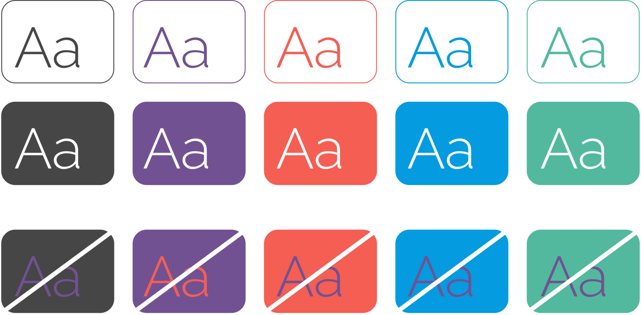
The following guidance should be used when using typography with colour. There should be enough contrast between the colour of the typography and the background. Examples can be seen here, however these are not exclusive. These rules should be used across all typefaces including those used for The Art of Finance and The Grad Scheme.