The Art of Finance is designed to support individuals who are new to the industry and looking for their first step, and those who are already in financial services looking to develop their career.
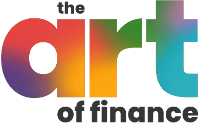
The Art of Finance logo is colourful, creative and simple.
The gradient has been used to give the brand a creative and artistic feel, and the font used is strong clean to give the brand a more modern edge.
The Art of Finance uses Poppins as its primary typeface which is a modern, flexible and easy to read font. Poppins ExtraBold should be used for titles, and Poppins Light used for body copy.
Hey March should only be used for accents.
The Art of Finance colours are chosen to convey a fun and young brand, using a range of gradients. The gradients show how all of our expertise and experience can work together in a vibrant, positive and creative way.

A key design element to The Art of Finance brand is the paint splatters, which can be used in two ways.
Firstly, you can overlay a full gradient on an image, reducing the transparency appropriately for the selected image.
Secondly, you can use the original image with no overlay on a white background to add depth to the design.

Photography used across The Art of Finance should show real life situations and people. For example, these can be people studying or people working in their role. These should show positivity, fun, laughter and be uplifting.
Images should be either used in full colour or with one of the brand gradient overlays applied.

The Art of Finance is similar to the main Verve style, it is friendly, clear and informal. Even when talking about financial topics, explanations are kept simple and all jargon is explained.
The Art of Finance is helpful, knowledgeable and little bit cheeky! Their mission is to educate and to make financial services interesting.
The Art of Finance training is designed for anyone – whether they have financial services knowledge / experience or not. This means that any time we mention a specific topic, we like to explain what it is, or write out any abbreviations in full at first so that anyone that reads our communication can follow along. We try to keep it all fun and positive!

The Art of Financial social media posts should be bright, engaging and informative. They should all have a clear call to action.
They should be a mix of photography and multi-coloured gradient backgrounds with bold, typography.

For The Art of Finance documents and slides, please use the templates below.
