Ensuring that our brand guidelines are also applied across our technology is equally as important as across other touch-points. Reflecting our brand in our technology ensures that the visual appearance is always of the highest standard and reflect our overall vision for Verve.
The guidelines for our technology cover everything from typography and colour, to buttons and selection fields. They define specific styles for every type of asset and dictate when they should be used.
New features and assets will be added to this live document as the technology develops to ensure consistency across the software. For the latest version of these guidelines, just click below.
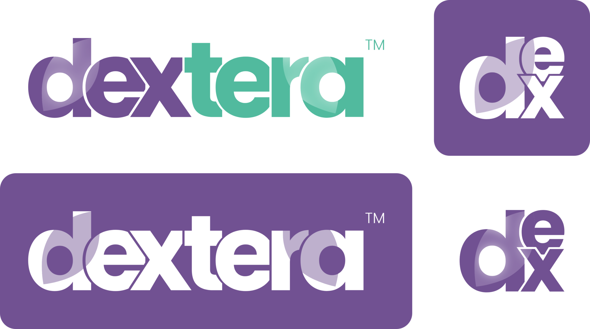
When introducing our technology to prospective clients or in marketing materials, Dextera™ should be used. This should always include the trademark symbol afterwards (™). When in conversation with existing clients either informally or in updates or comms, Dex may be used.

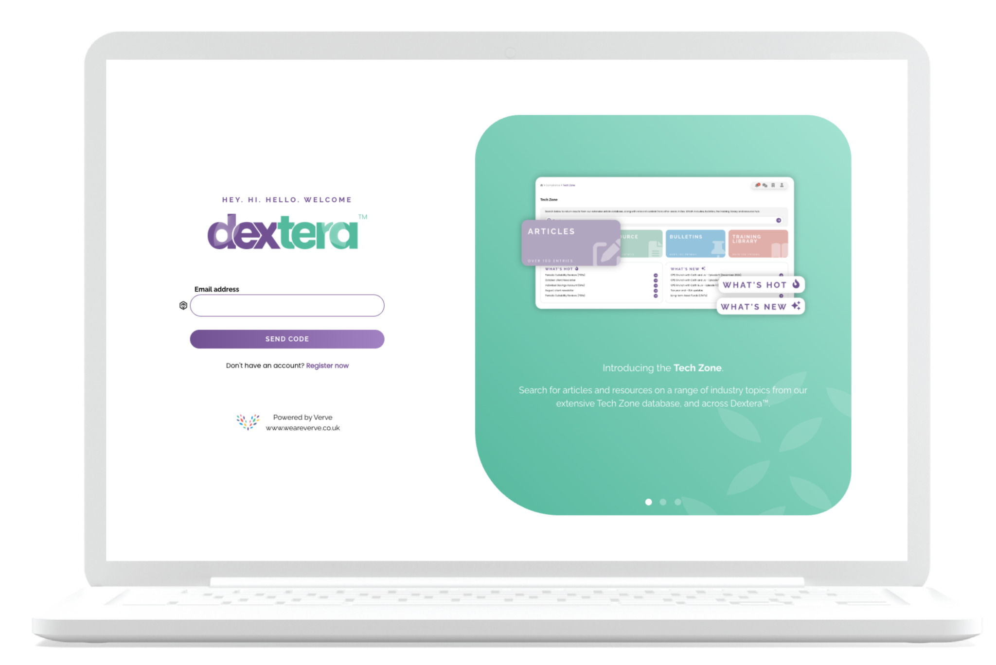
Where possible, the main Dextera™ logo should always be used. This can be in either full colour on a white or pale grey background, or white on any other colour. Where there is not space for the full logo to be used, the sub-logo should be used instead, for example in the navigation bar on Dextera™.
When ‘Dex’ is being used within marketing materials to create part of a heading, there is an alternative version that may be used only in this context.
The guidelines for our technology cover everything from typography and colour, to buttons and selection fields. They define specific styles for every type of asset and dictate when they should be used.
Typography used should be consistent with the main Verve brand and the system. Clear contrast should be maintained and block capitals should be used sparingly.
To differentiate any Dextera™ marketing, only the primary and secondary colour palettes should be used. These will look familiar to clients as they are the main colours they see across the system. Maintaining familiarity is important so clients recognise that any updates or communications (such as mailers) are relevant to them. Neutrals from our main palette may be used where needed.
.png)
The main graphic element used with Dextera™ are the frosted leaves. These can be used in any of the primary and secondary colours. In Dextera™, the frosted pill was also introduced, which can be used in marketing materials to highlight new updates, features and resources.
Any buttons used should follow the tech guidelines to ensure they have the correct padding consistent with both Dextera™ and the Verve website.
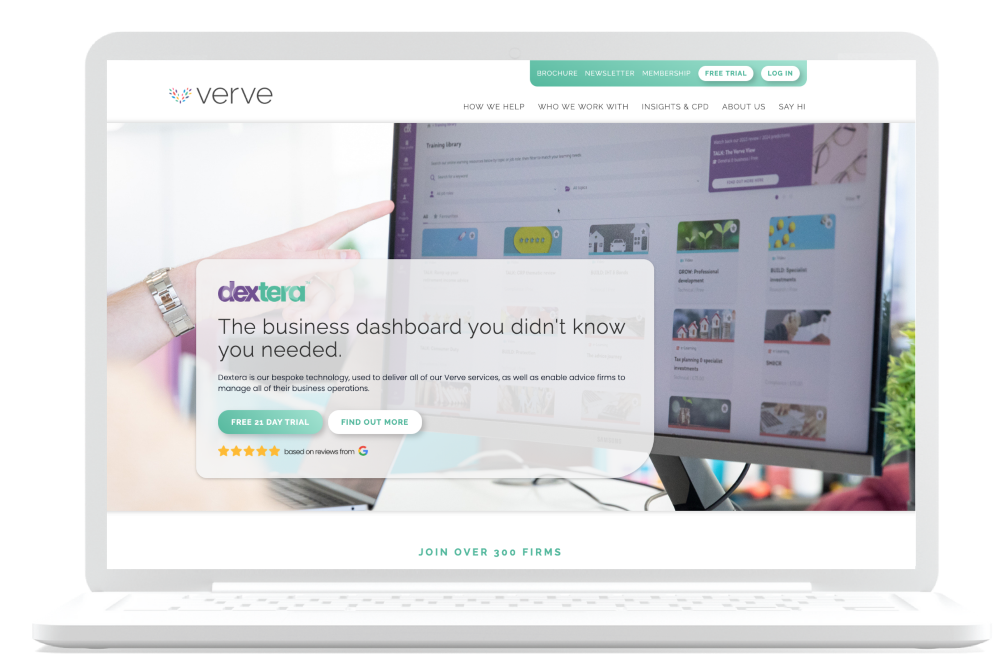
Any mock-ups (desktop, laptops, tablets, etc) used across our marketing materials for Dextera™ should also be consistent in a clay style.
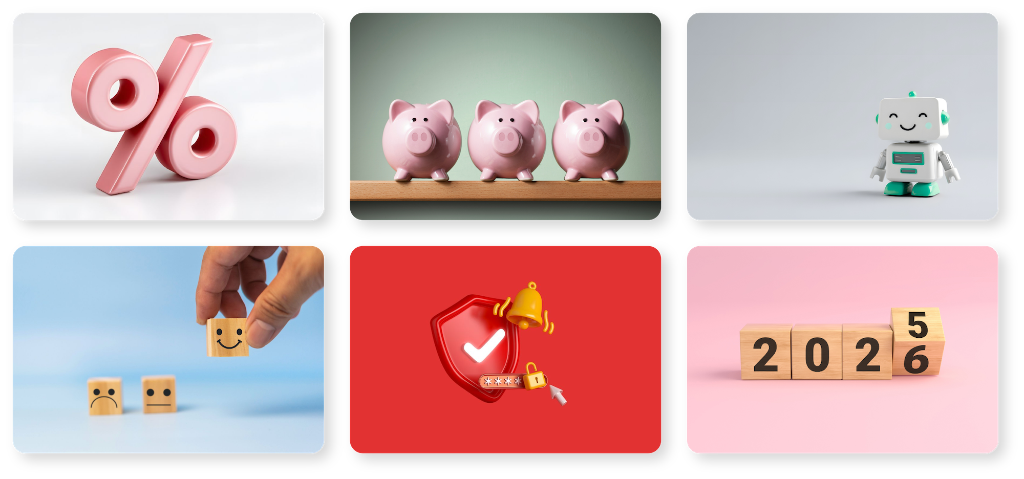
Each bulletin in DexteraTM has it's own image (in header and thumbnail sizes). These should be the same style as Verve - abstract imagery sources from attribution-free websites. Images should be bright, colourful and selected carefully for its purpose.
The only exception to this is branded visuals for series or events.
If sourcing appropriate stock photography, please use one of the following websites; Canva, Unsplash or Pexels. When selecting finance-related imagery, please ensure any currency is GBP.
To ensure consistency with our general marketing, we use the same style of iconography. They should be sourced from Font Awesome and only used in our brand colour palette.
Where the icon is being used to reference part of the system, please make sure you are using the same icon that clients will see within Dextera™. For example, if you are referring to the Resource Hub, please ensuring you are using the icon used for this in the navigation bar.The main graphic element used with Dextera™ are the frosted leaves. These can be used in any of the primary and secondary colours. In Dextera™, the frosted pill was also introduced, which can be used in marketing materials to highlight new updates, features and resources.
To ensure consistency with our communications within Dextera™, please use the following typography hierarchy for events and bulletins:
Events:

Bulletins
