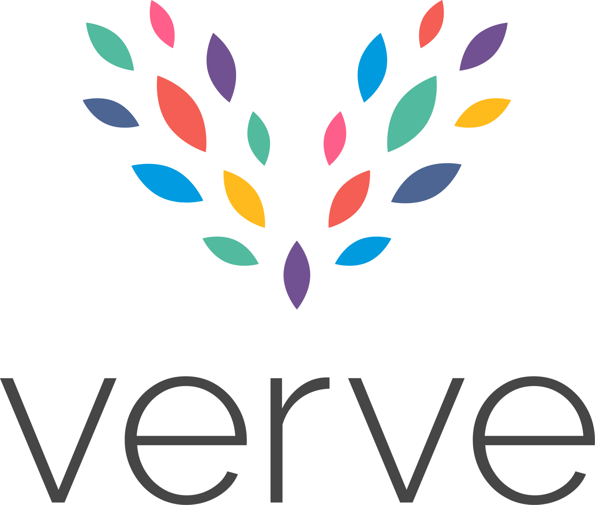
The Verve logo is the brand’s focal point and is instantly recognisable as the symbol of our brand – it is vibrant, energetic, clean and professional. Our logo represents energy, vigour and vitality.
Our icon is made up of separate ‘leaf’ shapes which combine to create the V shape for ‘Verve’. Each of these leaves is an abstract representation of all of the different elements and individuals that make up Verve. Each shape is colourful and unique, taking on colours from our original brands to tie everything neatly together.
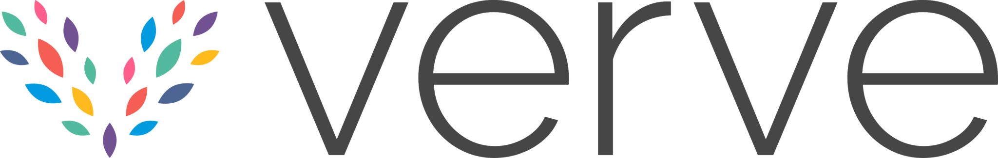
The logo by default should be used in the standard layout, with the icon positioned above the wordmark. However, in cases where there is limited vertical space, the alternate layout can be used, where the icon is positioned next to the wordmark in a horizontal format. When being placed on a graphic or document, it should always be aligned to the bottom right (using the spacing rules below). If this is not appropriate, please align centre bottom.
If colour is not an option for technical reasons, you may use either the whiteout version. A simple, one colour version should be used where gradients may not be possible. The inverted version should be used on the dark grey background or on top of photography.
Establishing a minimum size ensures that the impact and legibility of the logo is not compromised. Please ensure you do not go below these recommended sizes. To provide clarity, the logo must have clear space. As a general rule, the minimum space around the logo is equal to the “verve” text.
Please do not stretch, condense, augment or distort the form of the logo. Changing any graphic element of the logo will weaken its impact and detract from the consistent image we seek to project. The illustrations describe some, but not all, inappropriate uses of the logo, and an exception to these rules.