Internal communications is the process of aligning a team to the company strategy by systematically informing, influencing, motivating, and engaging people at all levels of the company. This is usually done through the one-way and two-way channels — digital and physical — that are most relevant to each team member.
When talking about Verve internally, more informal, colloquial language can be used to demonstrate the culture, values and behaviours of the team.
The same tone as external communications should be used; clear, positive, helpful - and a good sprinkling of fun! This doesn't mean that we go overboard - but instead means we're more likely to use everyday language (and some slang), including puns and idioms to add a bit of humour.

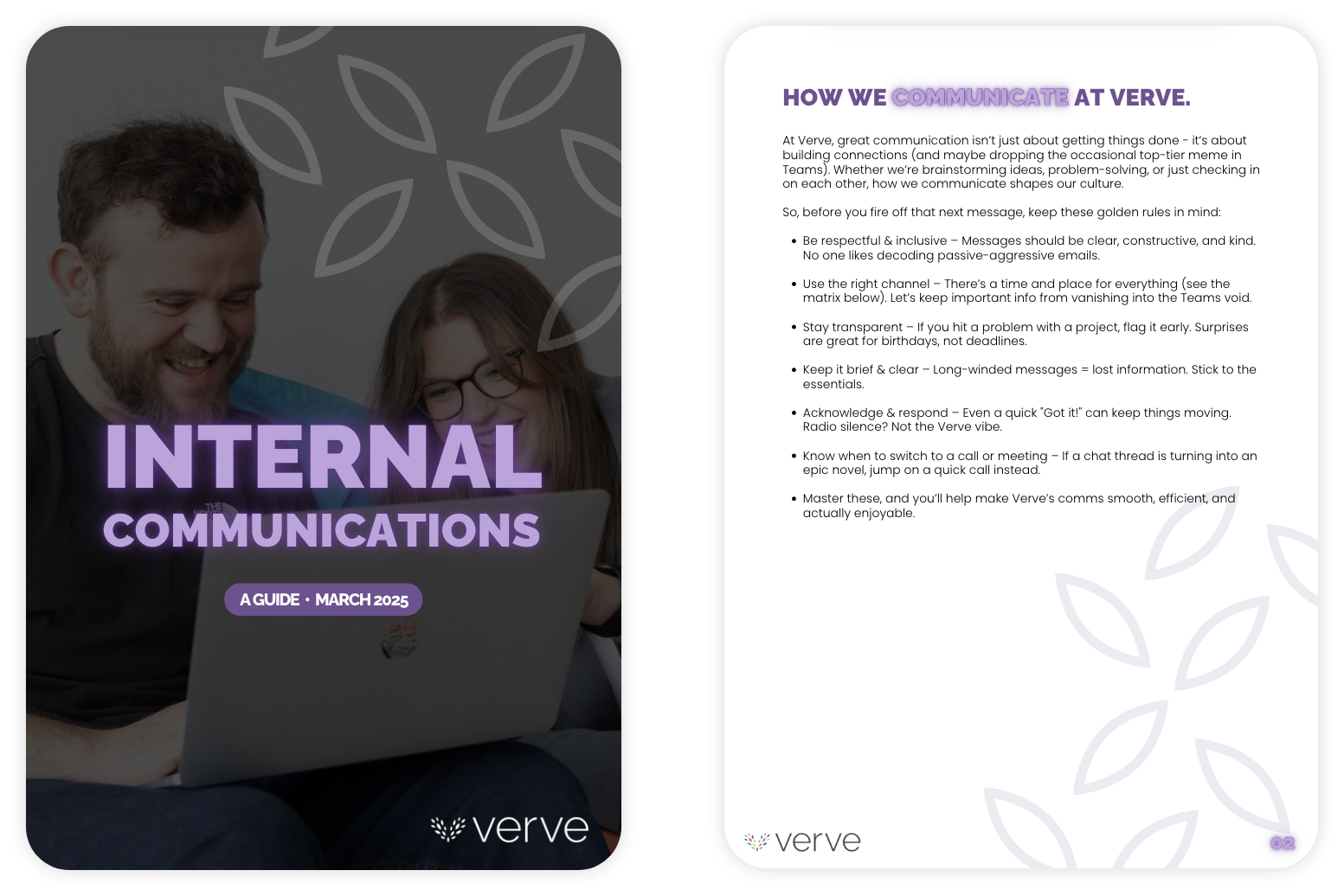
For consistency, we continue to use the same primary and secondary typefaces as the rest of Verve branding. This makes sure that written materials are clear, easy to read and recognisable as Verve.
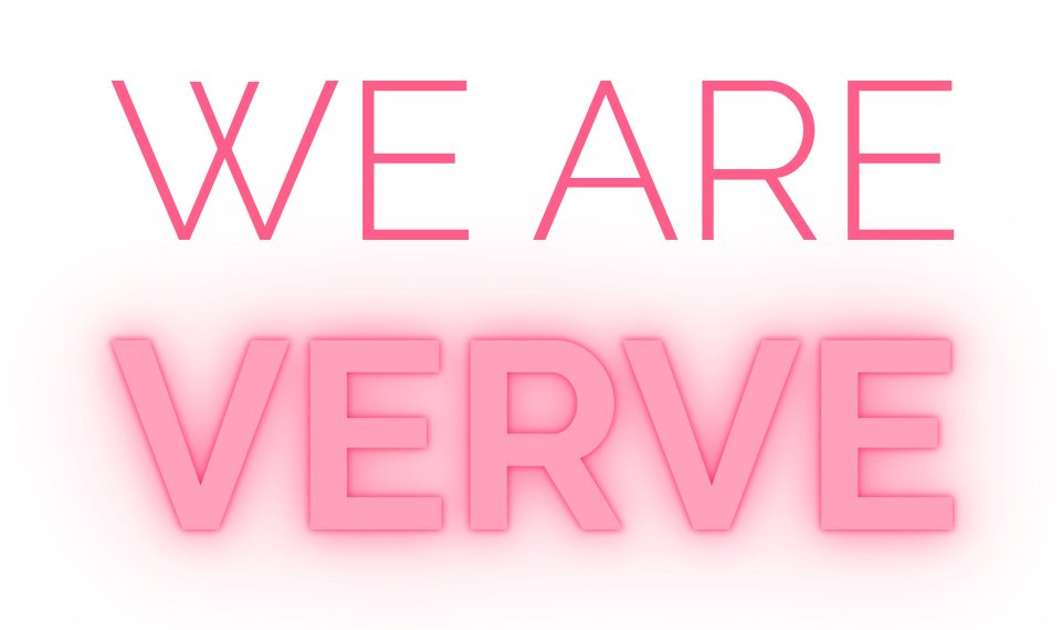
However, to differentiate typography style from the main brand, we have introduced the use of all-caps neon text to complement the solid typeface. This should be used sparingly and can be used in any of the primary, secondary or accent colours. Additional all-caps headings can also be used to compliment the neon text.
For more information on using typography, just click here.

To differentiate our internal communications from our external marketing, we have a series of alternative graphic elements for use across all internal touchpoints.
The new elements are consistent to the main Verve brand, but using only the outline of the leaf shapes. They can be used in any of the Verve colour palette.

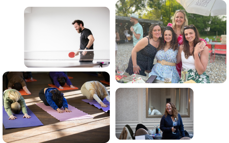
Our photography style for internal communications is informal, fun and energetic. Photography should include a mixture of candid office shots; including the team, the culture, the office and social events.
They should be casual, fun and showcase what working for Verve really looks like.
