Brand colour psychology is about more than just associating a brand with its signature colour. Colour is a primary means of visual identification that we use to create a powerful emotional response. It’s about the feelings and emotions these colours inspire in us.
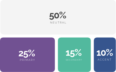
Our colours are a combination of the key colours from the original brands that made Verve, and they work together to convey a bright, energetic and colourful brand. The colour palette should be used in the correct balance, with the primary and secondary colours being used most prominently.
.png)
To ensure our brand remains consistent and clear, maintaining the correct colour balance is essential. The following colour hierarchy should be followed at all times; with lots of neutral colours, moderate use of the primary and secondary palettes with splashes of accent colours. The secondary palette should be used for call to actions and the accent palette used for secondary call to actions and to highlight important information.